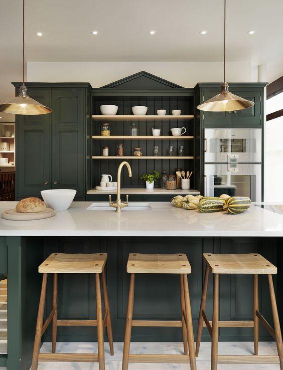
HUNTER GREEN
Hunter green was hugely popular in the 90s (I may or may not have worn a hunter green bridesmaid dress in a dear friend’s wedding) and has since fallen out of popularity. But in 2017 this color is being reinterpreted with high contrast colors (white), warm woods, and metallics. Think English country cottage with a twist, or rural French bistro reinterpreted.


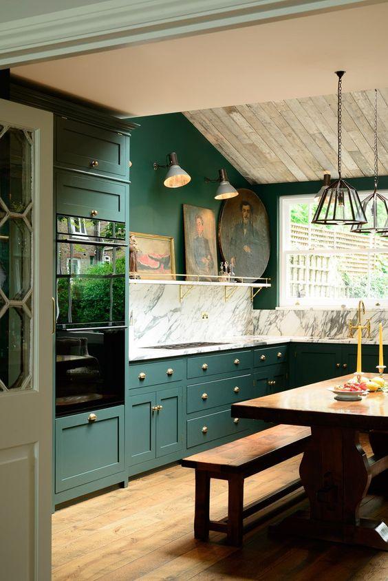
Pair either of these looks with loads of natural warm woods, brass fixtures, and clean modern countertops in quartz or marble to offer a high contrast to the dark cabinetry.
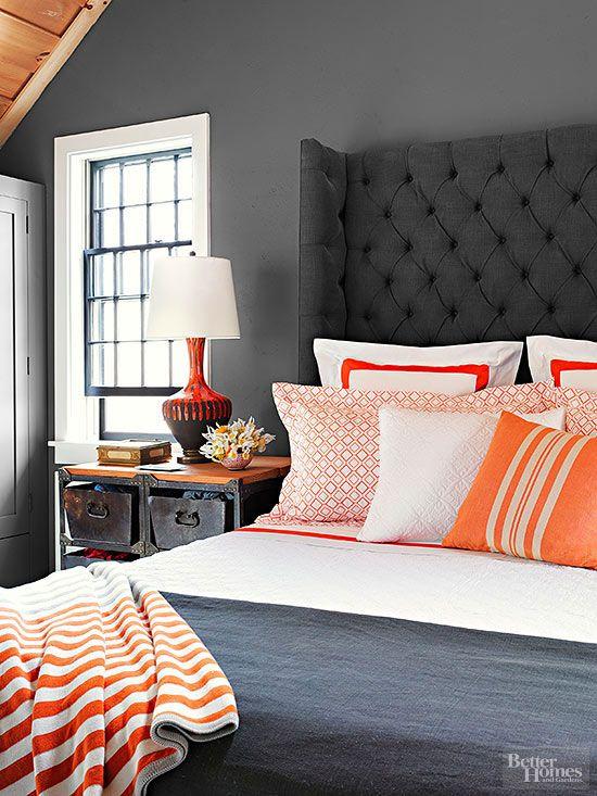
GREY MATTERS
Grey paint isn’t necessarily a new trend, but it’s pairing up with some other colors and textures. I’m expecially loving the way it juxtaposes against rich, warm woods. It’s not the first color combination you’d think of, but it works.
In this deep charcoal bedroom, pops of orange pick up the color of the warm woodwork in the eaves overhead. Notice in both photos how much the white balances out the darkness of the grey (I’m sensing a theme here!).
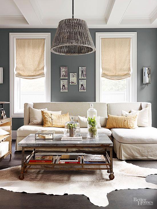
Charcoal walls with natural linen makes for an easy and calming living room. Load on the natural elements: a rustic pendant overhead with a hide rug underfoot.
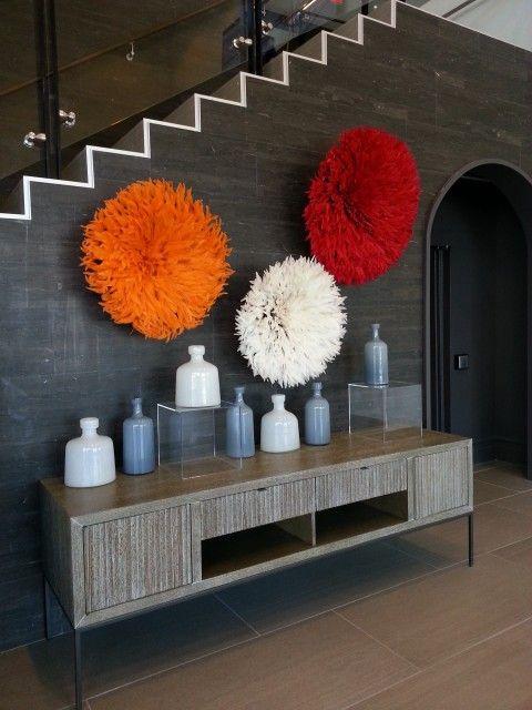
It’s not just about the pale grey though. If you’re not a fan of neutrals, give charcoal a try. It is the perfect backdrop for pops of color. These African juju hats explode in a flurry of saturated color in an otherwise masculine and monochromatic space.
NEUTRAL NAVY
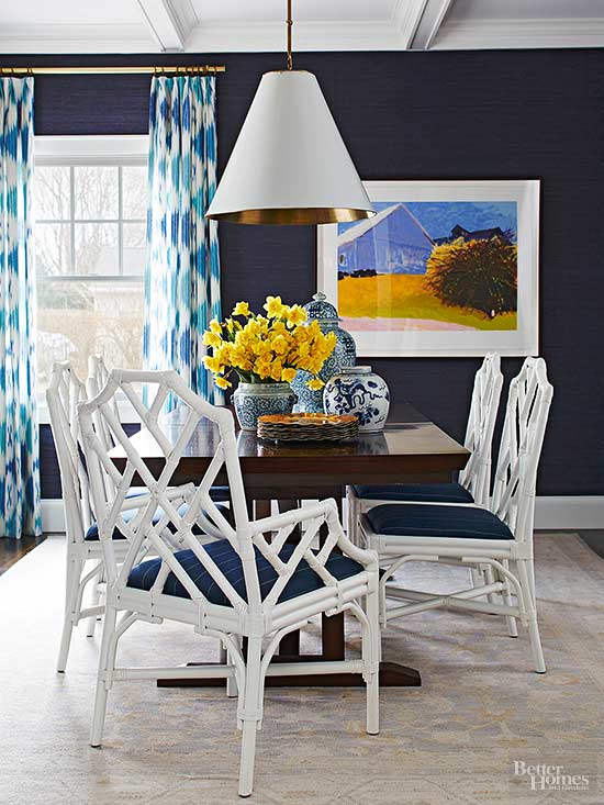
Navy is huge right now, and for good reason. It pairs well with practically any other color and acts as a neutral. It can be soothing, preppy, boho, or crisp depending on your overall style.
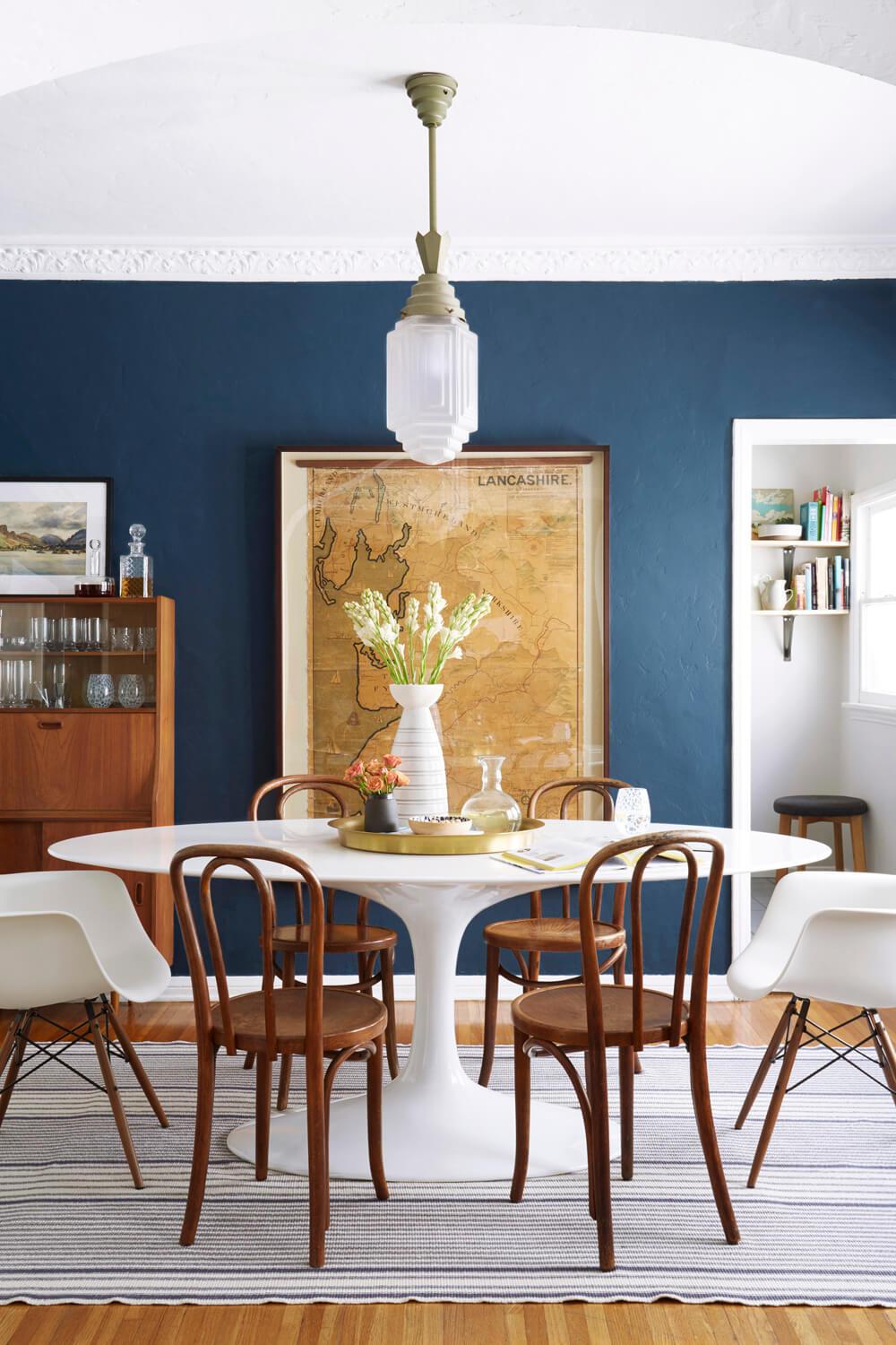
Emily Henderson’s assistant Ginny revealed her brand new dining room and all of the contrasting white woodwork and ceiling keep the navy walls from feeling too dark and cave-like. Contrast is the key.
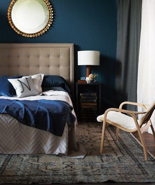
This navy is a little bit more of a peacock hue – still moody and rich, but definitely a touch more exotic.
But if that sounds all a little too dark, try a velvet upholstered club chair to get the look without major commitment.
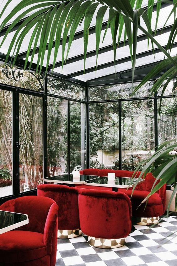
ROUGE RED
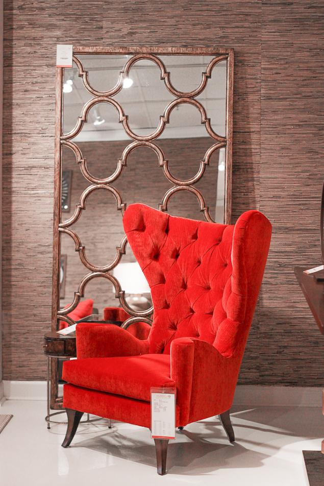
Red is making a big resurgence. It hasn’t been super popular in the past decade, but I’m thinking we’re going to see a lot more of it in a whole new way. It can be overpowering unless it’s used sparingly, though. Save it for when you want to make a big statement. I saw tons of saturated red rooms when I was at High Point Market, like this vignette in the Bernhardt showroom, and there’s no color more eyepopping and statement-making than this.
The key to keeping it from overwhelming the room is to counteract all the bold color with places for your eye to rest. In this space, the linen upholstered bed provides a visual break.

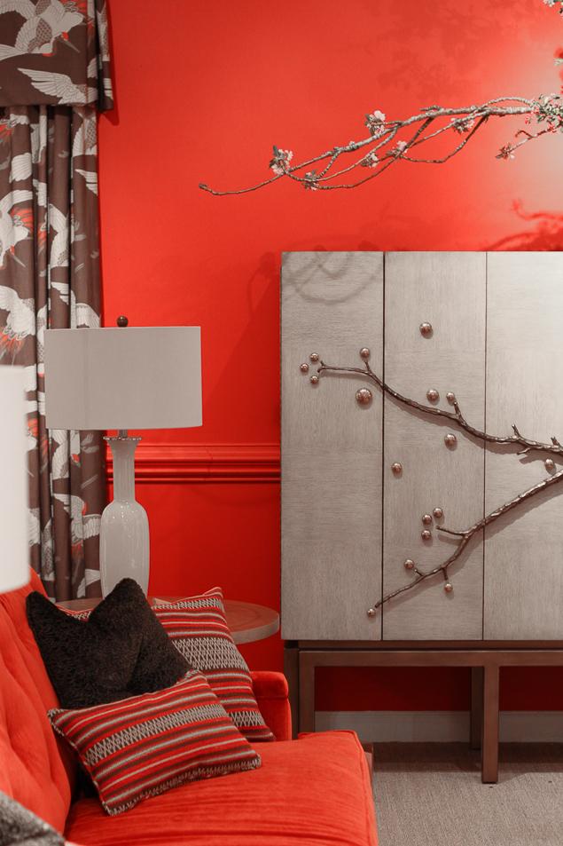
Counteract any bold, statement making color with a calming neutral. I love the way this grasscloth wallpaper provides texture against the coral red velvet chair.
Of course, red is nothing new. Case in point is this lovely Parisian cafe scene, complete with swivel velvet chairs.
]]>